

Branding . Graphic Design . Communication . Brand Book
Crissanta
A space where dreams steep and souls connect
Crissanta Mexico
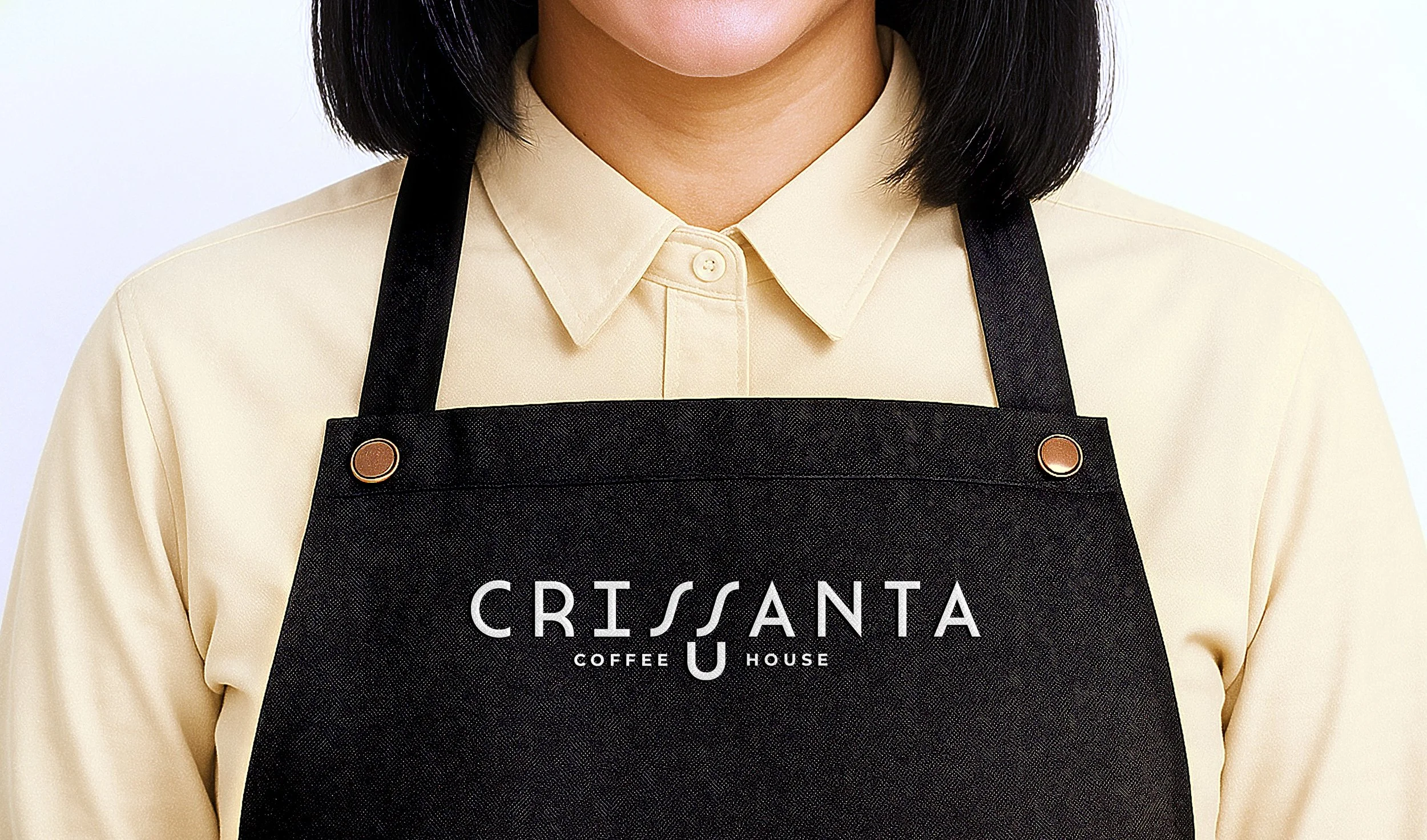
Crissanta was born from a shared dream between two friends—both named Sandra—who longed to create a space where passion, craft, and connection converge.
Its visual identity subtly celebrates this bond: the mirrored “S” characters in the logo rise like twin streams of coffee-scented steam, elegantly capturing the warmth and essence of the brand. The Art Deco–inspired typography brings a refined minimalism, balancing vintage charm with contemporary sophistication.
From its name to its design, Crissanta is more than a coffee house—it’s a symbol of friendship, intention, and the aroma of dreams realized.
Crissanta is a quiet tribute to souls united by purpose and lifted by scent.


Diep Studio. © All rights reserved 2025